ALPHAHOOD
Branding / Social Design
Alphahood is the community where men return to their true inner self, back to primal instinct, energising the alpha within.
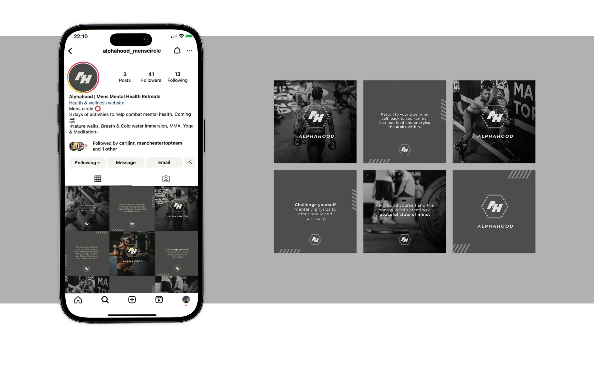
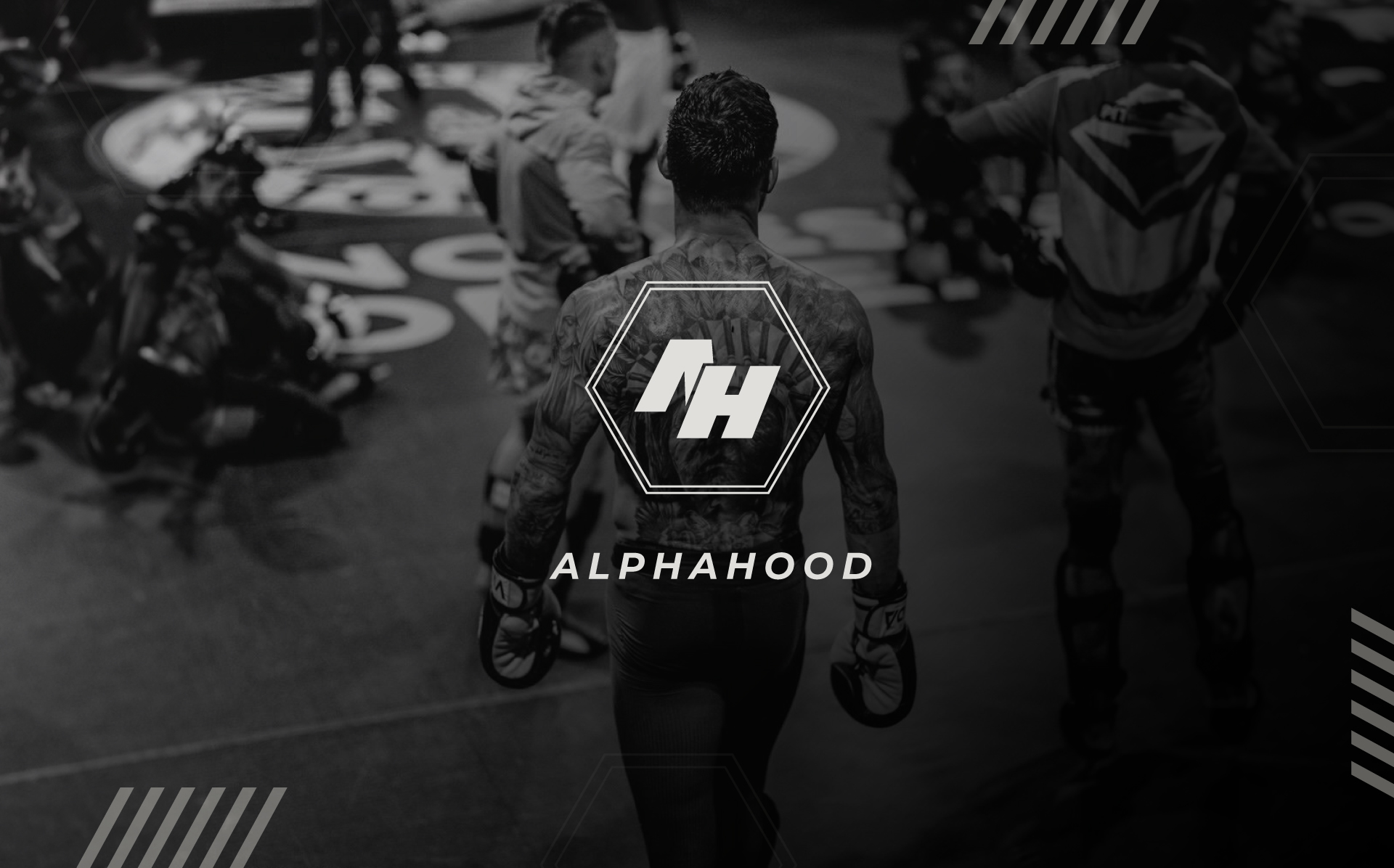
The client wanted something which was serious, bold and stood on its own. The main identity of the logo is a sharp monogram of a custom type enclosed within a double fine line honeycomb. The honeycomb is a subtle nodd to the clients origin and hometown – Manchester – it also links closely with the shaping of the octagon fighting ring within the sport. Alphahood offers a variety of services prodominetly within sport, training and wellbeing and the clients main source of advertising and marketing is through socials channels and networking. A complete look and feel was achieved by bringing the styling from the logo through to social assets, applying sharp block additions to the design and desaturating imagery gave the overall masculine feel and a dark moody look which complimented the imagery and brand.
Have a project or an idea you want to pick up off the ground? Drop me a call or give me an email by clicking below, and let’s see how I can help.


